Onboarding and Engagement for Staffing (Web App)
ROLE
Lead Designer/ Project Manager 👩🏻💻
BACKGROUND
EmployStream is an onboarding automation and candidate engagement platform for Staffing agencies. The admin tool (Workflow Manager) gives users an easy way to manage applications and onboarding documents. Unfortunately, this requires the process of converting paper forms into digital ones, which can be quite a hassle.
TIMELINE
June 2018
1 monthTEAM
CTO, Founder (Manager)
1 DeveloperTOOLS
Sketch, Anima Toolkit
PROBLEM
EmployStream's Customer Success team was spending hours on the phone training each customer how to build forms for contracts, payroll, and new hire onboarding. In fact, the company created an entire job dedicated to building forms for customers because the old tool was time consuming, difficult to use, and involved a steep learning curve.
Original Form Builder
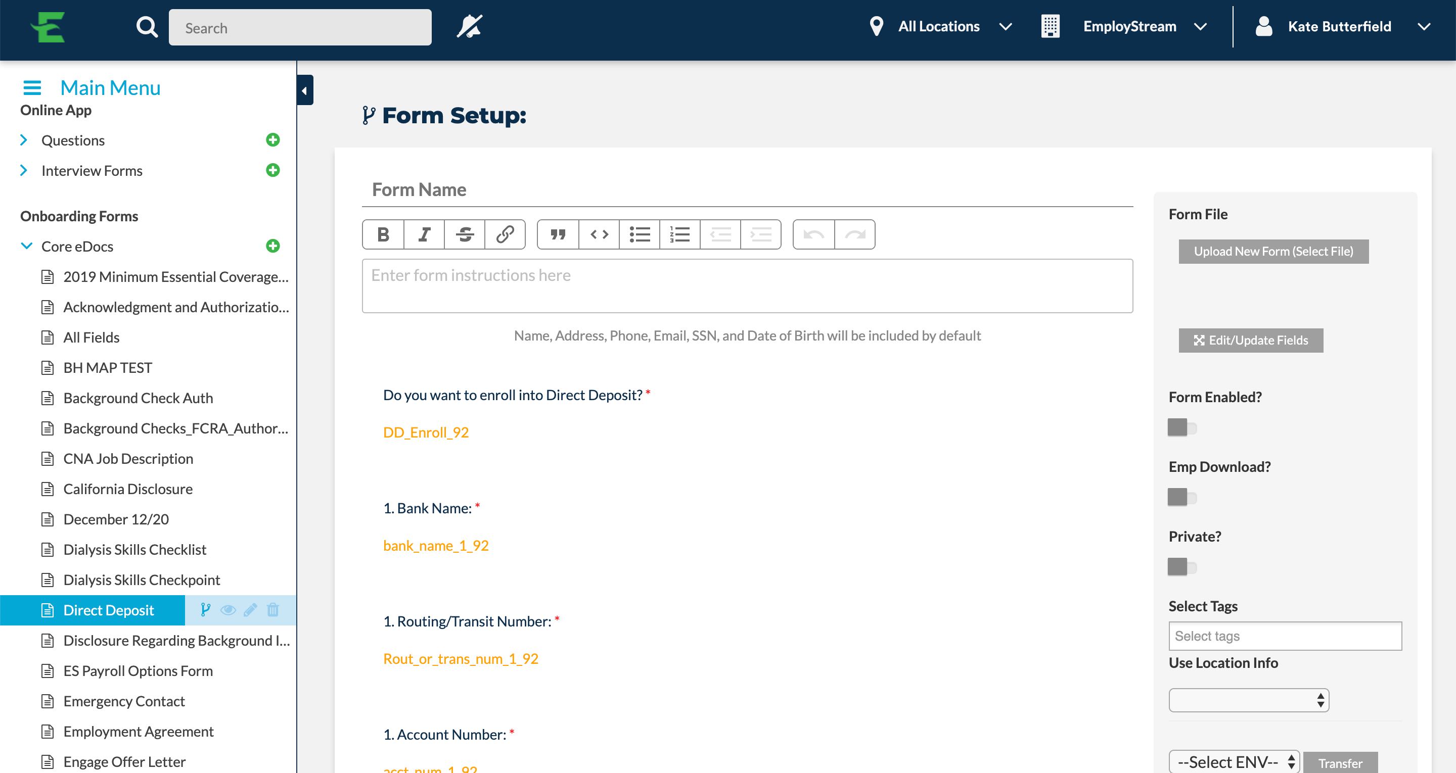
← Different field types, same UI
PROCESS
Research → Whiteboarding/Wireframing → Mockups → Iteration, Iteration, Iteration → Implementation
RESEARCH
I started by talking to users about their pain points when constructing a form with the original form builder. Then, I headed to FullStory to take some notes on how users were currently interacting with the tool. Some feedback I collected:
Lack of control over the layout of the page
Confusing interface - All field types look the same
Long, manual process with required training session
SOLUTION
I decided to approach the problem with 3 main solutions:
Field Type Visualization:
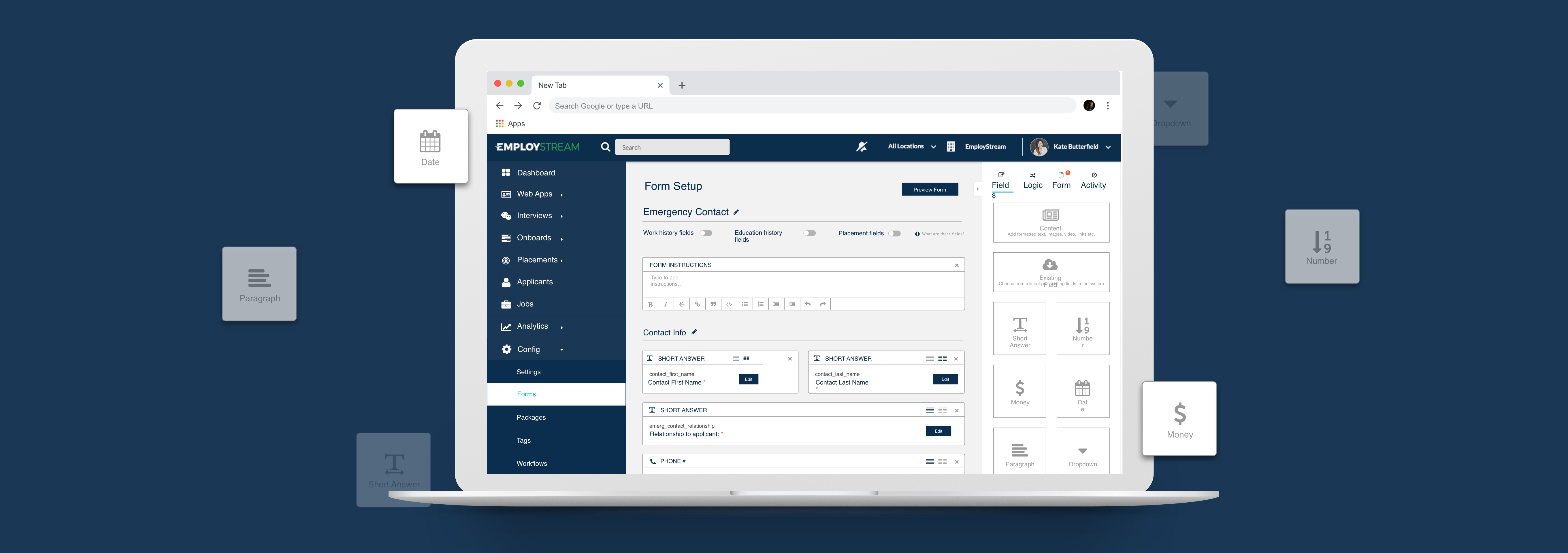
I associated a different icon with each field type (Paragraph, Date, Money, etc.), which will reduce confusion when interacting with them.

Drag & Drop Functionality:
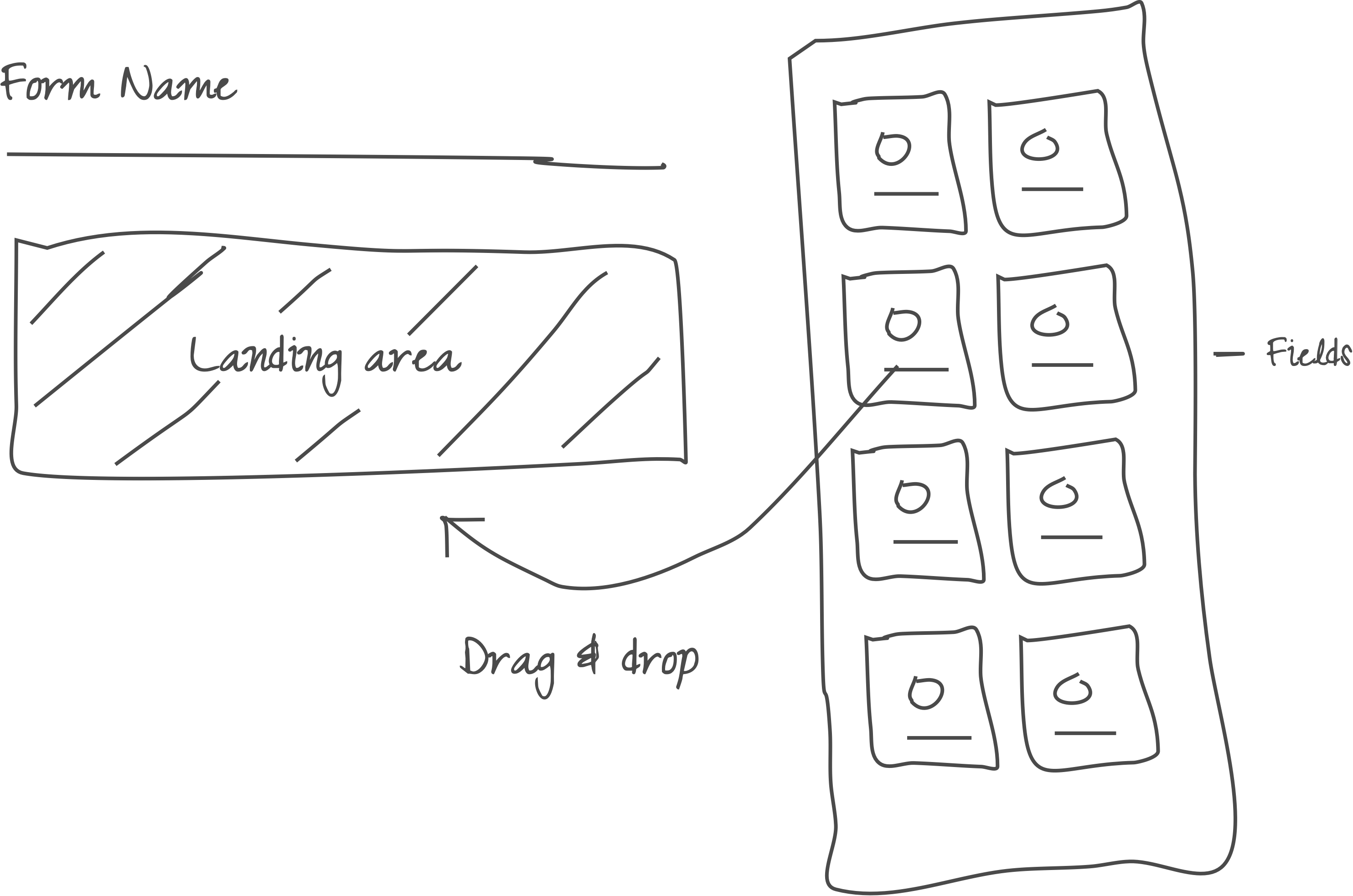
I decided on a drag-and-drop system - a visual way to interact with the interface that displays a clear landing area for each field.
Customization:
Users should have the freedom to customize the layout of the page to their liking. I planned for this in my design process, and came up with a feature that allows users to switch between a single or double column field (Dev team said no to more than 2 columns).
IDEATION
I immediately started whiteboarding with our Implementation Specialist who uses the Form Builder daily.
Wireframe
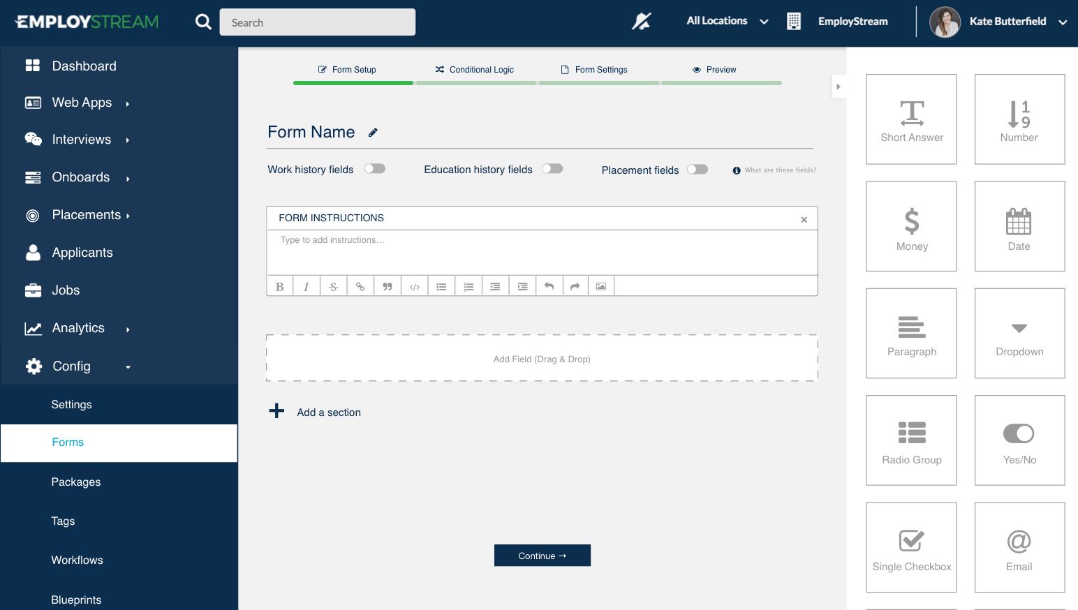
1st Iteration
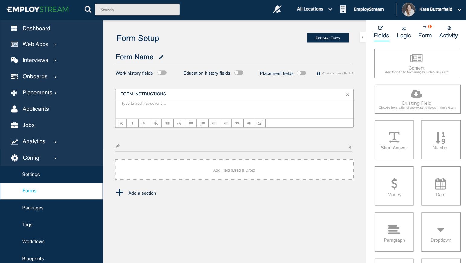
Final Iteration
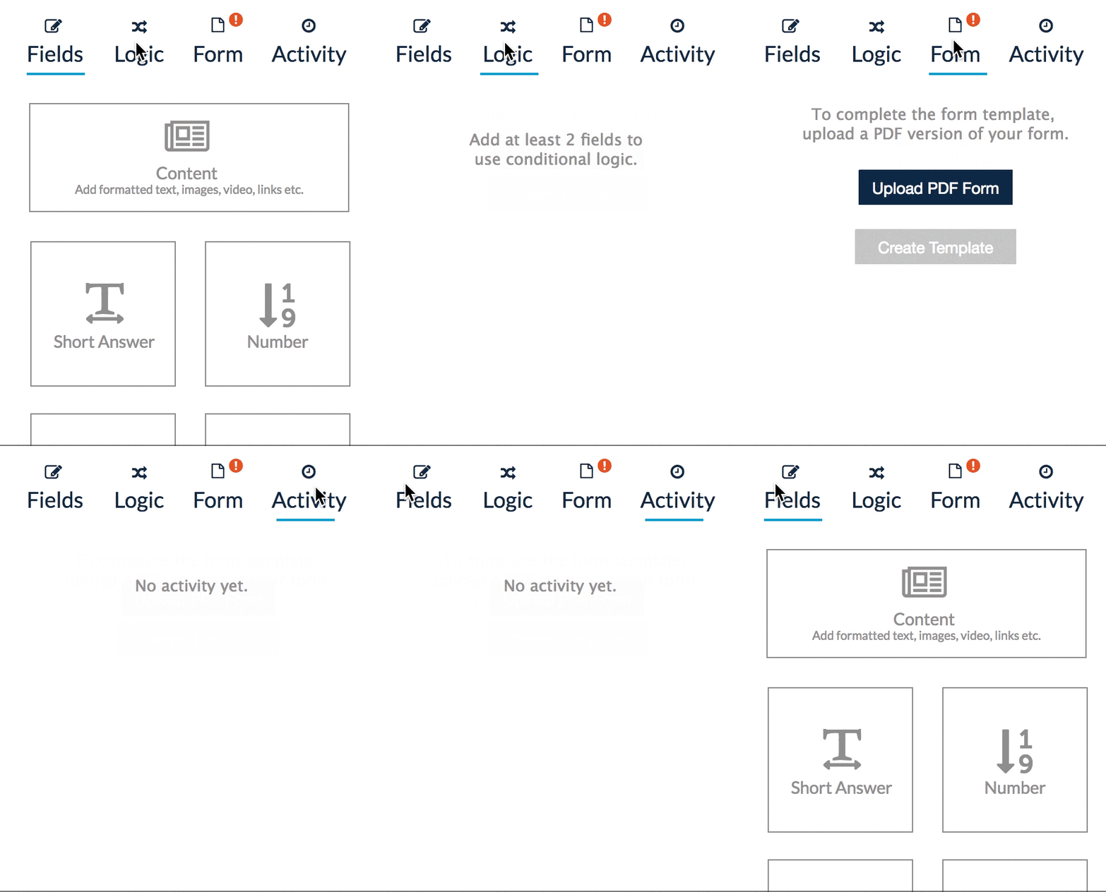
All steps live in one sidebar ↓
Side Bar
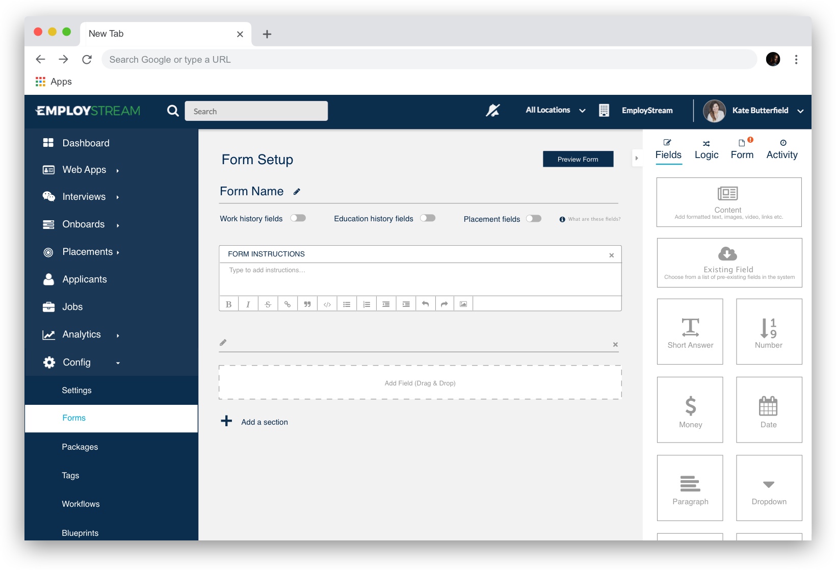
I decided on a tab system within the sidebar to allow users to configure all aspects of the form in one page. The red '!' icon indicates that the user needs to take action on that tab before completing the form.
Final Product
Initial Form Setup
This is historically the most difficult part of the process because users don't know where to start. I created a clear landing area for each field type so the user knows where to drag and drop them, and can visualize the end result based on the layout of this page.
Flexible Layout
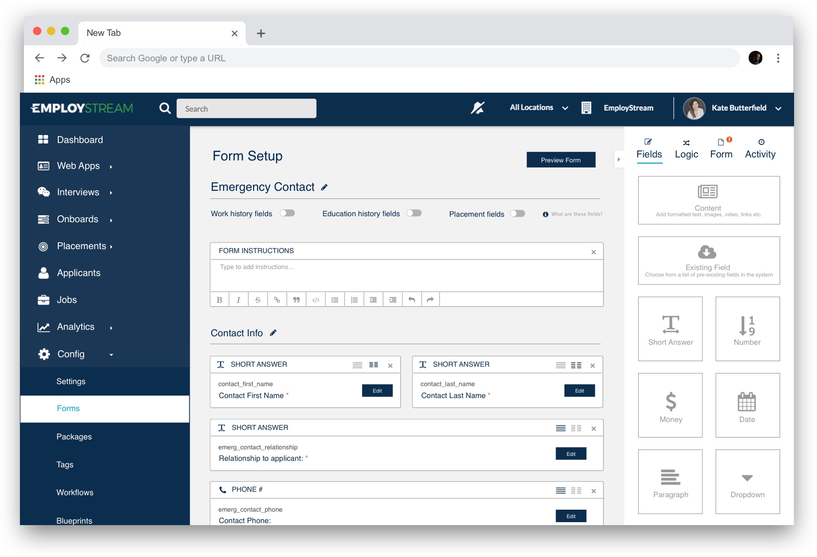
Previously, the system could only create single-column forms. With this new design, users are able to switch between a full/half column layout for fields like "First Name" and "Last Name" which make sense placed side by side.
Drag and Drop
To allow for more flexibility, this design supports the ability to reposition fields on the page by dragging and dropping them to snap into place.

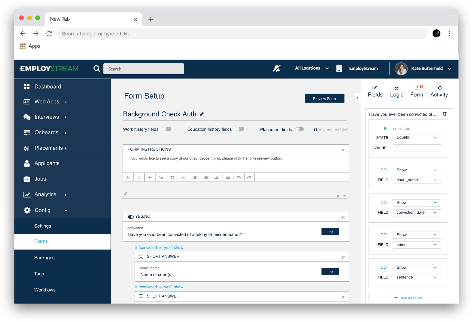
Conditional Logic
If 'this' then 'that' - This is the basic idea behind conditional formatting. I built this functionality into the "Logic" tab on the side bar so the user can configure this formatting while simultaneously viewing their changes on the form.
