Educational clips for teachers (Web App)
ROLE
Design Contractor
BACKGROUND
ClassHook is a platform that uses the ‘popular media’ pedagogy to help teachers engage their students. Educators use the site to discover short clips from popular TV shows and movies, such as Friends or The Big Bang Theory, that relate to a particular subject. They can also create playlists, add pause prompts (embedded quizzes), and post discussion questions to further the experience.
TIMELINE
June - July 2019
4 week deadlineTEAM
2 Co-Founders
1 Engineer (Founder)TOOLS
Sketch, InVision
Original ClassHook Homepage
Original ClassHook Sign-Up Page

PROBLEM
The original site was an MVP version using Bootstrap 3, and needed a major UX/UI refresh. The old experience created friction within the onboarding experience that prevented users from signing up and resulted in low feature engagement. For example, playlists (a main product feature) were only viewed by users about 110 times in 2 months.
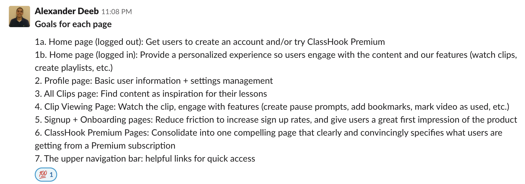
GOALS
The main goals for this redesign were to increase engagement, encourage Premium purchases, and increase sign up rates.

Educators are not always the most tech-savvy people.
How can I design an interface that showcases all product features, while maintaining an intuitive experience for an educator?
↓
SOLUTION
I tackled the redesign in phases, going through my design process for each page or element that I was assigned. There are a few overarching themes across these pages that I used to address the core problem.
Discovery:
I studied other video platforms like YouTube and Netflix to evaluate their video discovery techniques. According to YouTube Creator Academy, "Studies of YouTube consumption have shown that viewers tend to watch a lot more when they get recommendations from a variety of channels." I treated suggested or related clips with high priority throughout the site, with the intention of helping users find the content they need and maximizing their engagement with the platform.
Dynamic Page Layout:
Prior to my redesign, everything on ClassHook was displayed within one single container on the page - There was little visual hierarchy. To combat thisI created separate containers for different components on the page and organized them in a way that follows the natural pattern of the eye.
Before
After
PROCESS
Consultation → Ideation → Mockups → Design Reviews → Iteration → Implementation
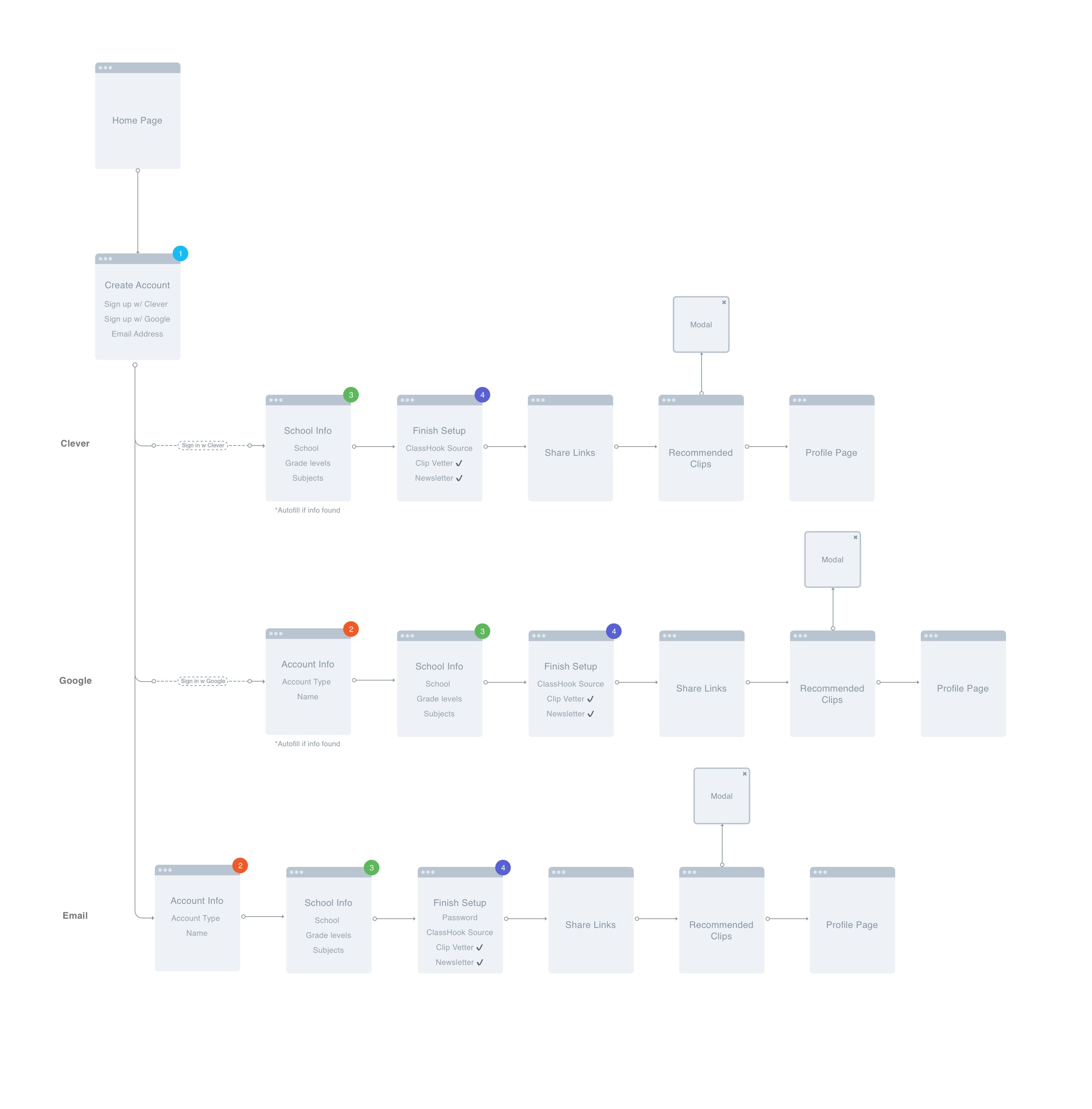
New Onboarding Flowchart
A note from the founder

Alex Deeb
Co-Founder, CEO
"Before starting any work, Kate asked questions to understand the project and the requirements. During our conversation, it was evident that she has a strong understanding of UI/UX design and the design process. Once the project began, it felt like a collaborative effort, which I appreciated. Kate was highly communicative and was always available to answer any questions. Although I felt we had aggressive design deadlines, Kate met them all without any issues. I don't understand how she works so quickly without sacrificing quality! We made changes to the requirements at several points during the project, but Kate adapted her designs seamlessly to fit them."
Final Product
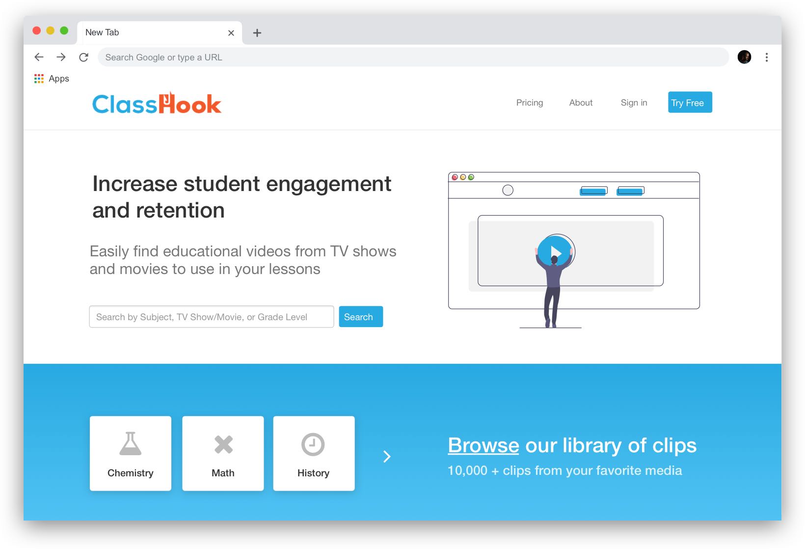
Homepage
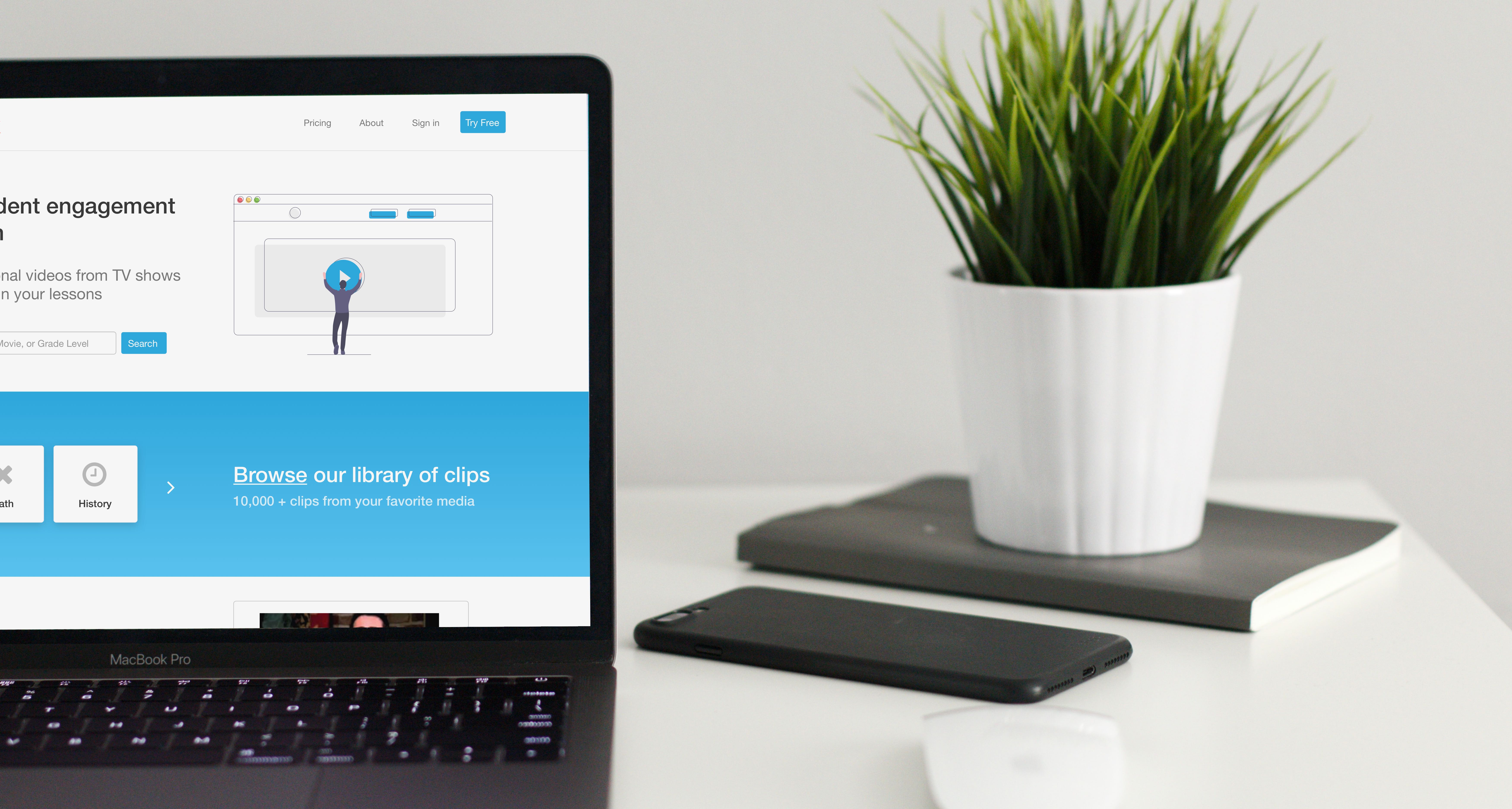
I designed the ClassHook homepage to emulate a landing page that guides the user towards creating an account using multiple CTA's. The page is informative, yet also offers the ability to test out the product functionality by running a search or browsing clips. The user is limited to viewing a max of 5 clips before creating an account.
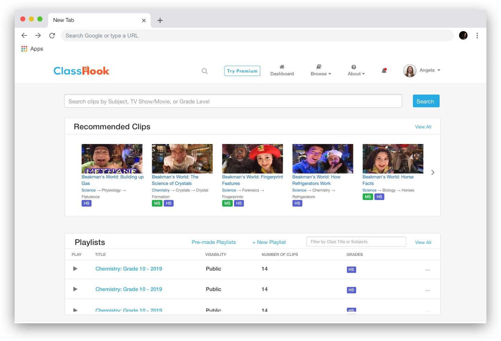
Dashboard
This dashboard is now the main hub for a ClassHook user to see all of their clips and activity. Educators can access all of their saved playlists, bookmarked clips, and more on their personal dashboard. Research shows that users often come to the site without an idea for a clip in mind, so I added recommended clips based on their school information to simplify the browsing experience.
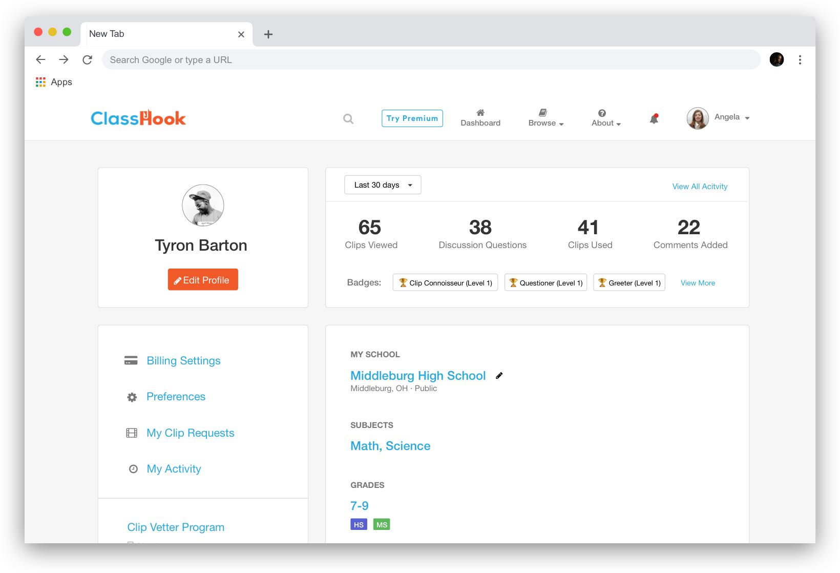
User Profile
This page displays all of the user's information regarding their school and creates a place for them to edit this info, change preferences, etc. I decided to add a bit of reporting to the page, which gives the user a snapshot of their activity and encourages them to use the product more.
Browse Clips
Research shows educators often use ClassHook without any idea what they're looking for. They like to browse clips in order to spark inspiration for videos they might want to use. To make this browsing experience easy, I added a fixed filter component on the sidebar so users can refine criteria as they scroll. Each category displays 5 of the most popular clips, with the option to view more within that topic.

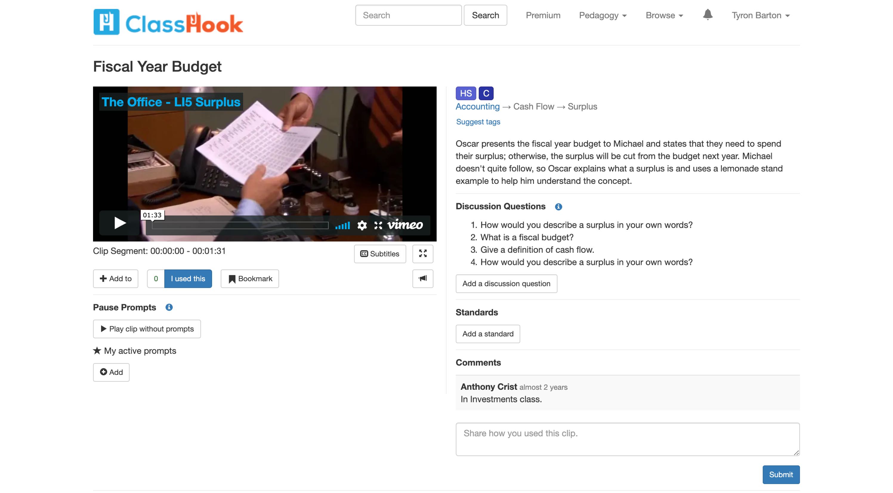
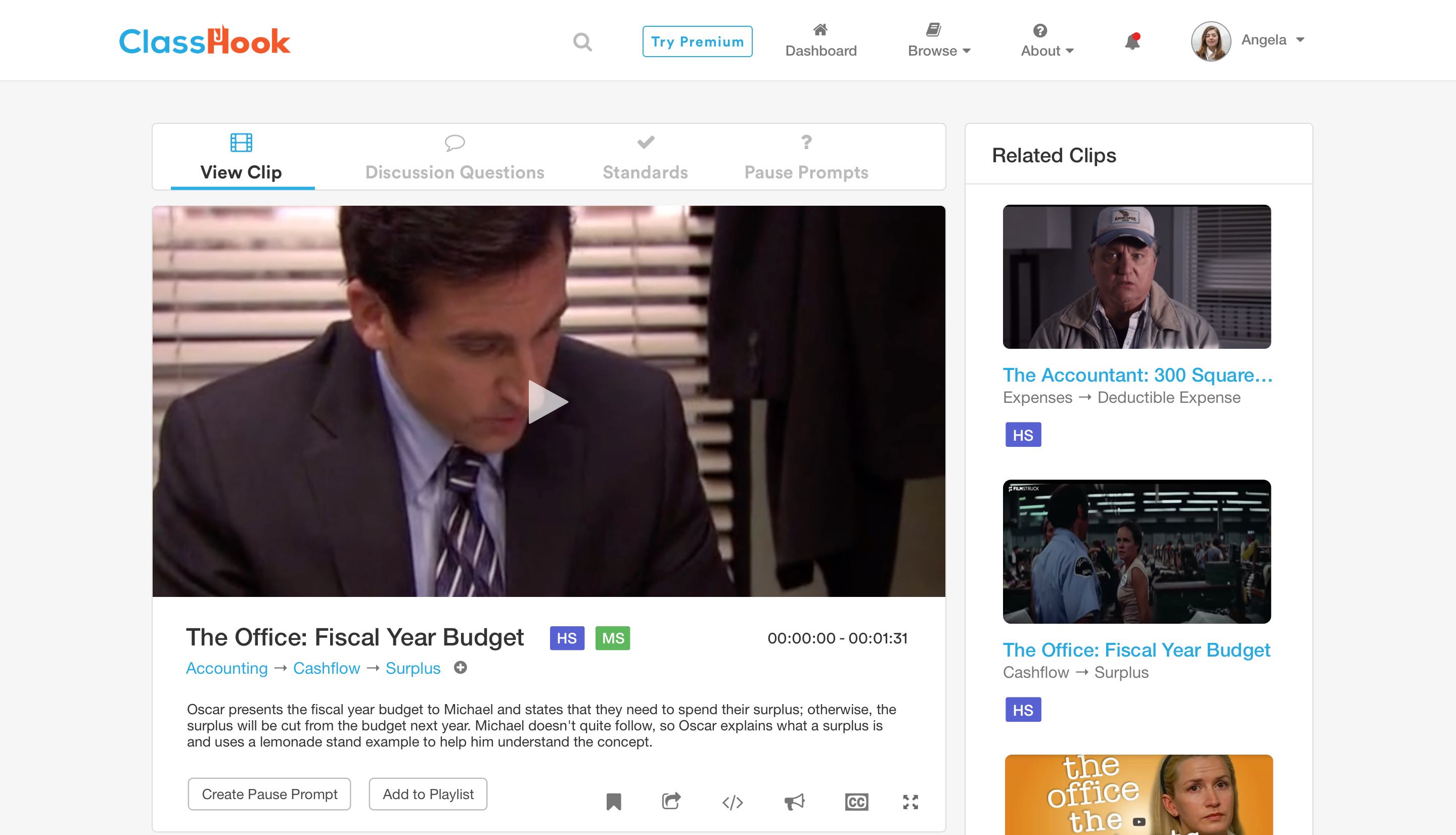
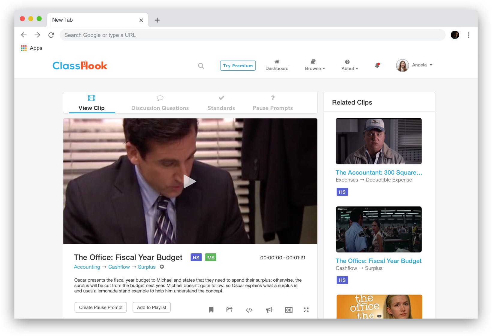
View Clips
I redesigned the clip viewing experience to focus on the media player. The page previously displayed an overload of information. To combat this, I incorporated a tab system that allows the user to manage additional elements without leaving the page. Data shows one of the most used components on the site is related clips, so I decided to show this section parallel to the media player to make it more accessible.
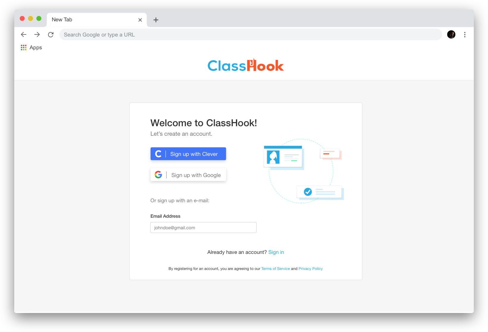
Onboarding
I reconfigured the ClassHook sign-up process by breaking it into steps that were easily digestible for the user. I started by mapping out the entire onboarding flow on a flowchart, then creating separate mockups for each step.
Want to see more from this project? Request full InVision Link